Role: Sole Designer & Developer
Team: Solo School Project
Tools Used: Figma
Duration: 4 months
Platform: iOS
Overview
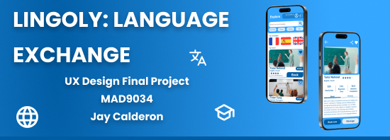
During the end of my third semester at Algonquin, we were tasked with a final project for our UX Design class which presented us with something new. We were to design an app which helps two different personas, a service seeker, and a service provider. I took some time to think of what made sense to me and I thought of a language exchange platform for tutors and students. I named it Lingoly.
Over a month of college student crunch, I created Lingoly from an empty Figma file to a great prototype. During this time, I had to be a researcher and a UI/UX designer. I truly leaned that empathy and iteration mean a whole lot in the design process.
Discovering the Problem
I started to talk to real students and teachers on what they need and don’t want. I created a survey for user research which got me a handful of responses and feedback. Some key things that stood out for me were:
- Learners felt adrift without clear goals or consistent feedback.
- Tutors struggled to stand out and manage their schedule.
There was a gap: no platform paired structured progress tracking with on-demand tutor matching in one seamless place.
Diving into Research
I rolled up my sleeves and:
-
Mapped the competitive landscape.
- Not enough interactivity with on-demand marketplaces.
- Fragmented experiences across course platforms.
-
Synthesized insights into personas.
- Jane, a 21-year-old university student from Argentina, juggling school and time to enhance her language learning.
- John, a high school Math teacher and private tutor who is in need of reliable bookings and authentic feedback.
These two personalities guided every decision that followed.
Sketching Out the Blueprint
With clarity on who I was designing for, I drafted an information architecture in FigJam:
-
Explore (tutors by language, reviews, rating)
-
Schedule (calendar view of sessions)
-
Messages (chat before and after lessons)
-
Goals (milestones, streaks, progress graphs)
Building it out helped me spot overlap, trim clutter, and ensure each tap led to something meaningful.
From Boxes to Screens
My design process progressed in three waves:
-
Low-Fidelity Wireframes
- Crude boxes, basic flows.
- Tested tap targets and message flows on paper.
-
Mid-Fidelity Mock-ups
- Polished spacing, hierarchy, and navigation.
- Played with card layouts so tutor ratings pop.
-
High-Fidelity Visuals
- A crisp blue for trust and action.
- Rounded cards, soft shadows, and clean typography.
- Mini “badges” and progress bars to award learning.
By the time I reached the final screens, every element had a purpose and some shine.
Putting It to the Test
Next came usability testing. I recruited five volunteers (Three learners, and two educators) and tasked them with:
- Booking a lesson with a tutor.
- Interpreting goals dashboard.
- Sending a quick chat message to a tutor.
Their feedback was great:
The calendar feels like its cluttered and the messages are hard to see within the messages tab.
So I understood I had to make changes to make the tap areas more intuitive and implement the colour theme more effectively. As this being a class project, I did not have enough time to execute everything that I wanted to complete. It’s now a big focus of mine to go over this project again and reiterate on the designs to follow the feedback fully I received on testing.
Reflection & Next Steps
Building Lingoly taught me that the best designs emerge from empathy, data, and a willingness to course-correct. If I had more time, I’d:
- Integrate better styling with more properly aligned components within a library.
- Add screens for summaries, flashcards, and video calling.
- Implement more social features for language-swap meetups.
Why This Matters
Lingoly lives at the crossroads of structure and serendipity: learners set goals and celebrate milestones, while tutors manage their calendars and shine in their areas of expertise. This project showcases my full-stack product design skill set—from unearthing insights and shaping architectures to crafting delightful screens and validating them with real users.