Role: Team Lead, UX/UI Designer, Frontend Developer
Team: 5 members (Design Lead, Development Lead, 2 Generalists)
Tools Used: Figma, Flutter, GitHub
Duration: 4 months
Platform: Android / iOS
Client: Pyralume - Indie streaming start up focused on local indie film creators
Overview
Pyralume was an applied research project completed during my final semester in the Mobile Design & Development program at Algonquin College. As part of our capstone, students were assigned real-world clients and grouped into teams. I was selected by my professors to lead my team, a responsibility I took seriously from the beginning.
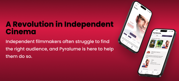
Our client, Pyralume , needed a bold and modern mobile app that blended video streaming, film discovery, and social networking for Canadian indie, BIPOC, Indigenous, and LGBTQIA+ filmmakers and film lovers across Canada. Our mission was to create a space where film fans can seamlessly discover, watch, and engage with filmmakers and their work—all in one intuitive and cinematic experience. As the team lead, I coordinated every stage of the project life cycle from early research to client meetings, technical development, and final delivery. Our focus was on accessibility, user engagement, and storytelling through design and functionality.
We delivered a fully functional prototype built with Flutter and Node.js, complete with video streaming capabilities, social features, and a clean UI inspired by modern design systems. Our client was genuinely thrilled with the final result, and the professors loved our team’s work, citing it as one of the top projects of the semester.
This project gave me the opportunity to flex both my technical and leadership skills, collaborate closely with a team of great designers and developers, and create something we were all proud to showcase.
Problem Discovery & Research
Project Overview
Pyralume is a social streaming platform designed to amplify the voices of indie, Indigenous, BIPOC, and LGBTQIA+ filmmakers. Think of it as a blend of Netflix, Instagram, and Letterboxd—where filmmakers can showcase their work and engage with audiences, and users can watch films, write reviews, and discover new talent.
This was our final-year applied project at Algonquin College. I led a cross-functional team of five, working directly with our client to define the product vision, craft the user experience, and bring the app to life using Flutter. We tackled everything from UX research to prototyping to frontend development—and it was a crash course in what it takes to build a real product with real users in mind.
User Research Summary
Our team conducted research all together by brainstorming questions that we found would be most effective at understanding our user base. We created an anonymous google form that would help us gauge what these users do when they are looking for new films or how to share films socially with their friends.
We tried to get an idea of what features users would be looking for in a social app dedicated to the film space. Along with this, we wanted to know how important it is for them to have a curated and customized collection of unique films.
Our survey consisted of 23 questions and we received 18 responses over the period of a week and a half. We asked around campus and other connections within the film/art industry to get relevant data. Here is the link to our survey.
I assigned tasks to the team on how to conduct the research and aided in developing questions which would be relevant to the product and what data we would need most. We were met with great succession on the responses we received because of those effective questions.
We spread our survey around to different people throughout campus and tried to target students who were in film programs mainly as they would most likely be our main user base.
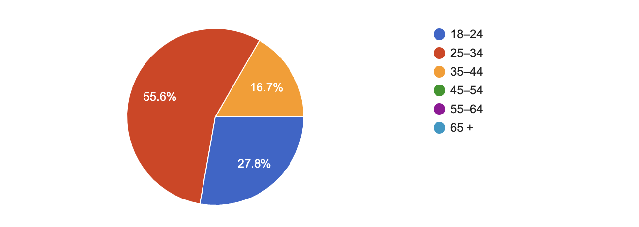
We received a decent range of age groups but it mainly consisted of those who were 25-34 which contributed to just over 55% of respondents. Almost all are students contributing to 72% of the survey.
With our questions, we were able to reveal that a significant pain point for users looking for films is that there is a fragmented and costly streaming landscape. Users are frustrated with having a costly subscription to services such as Netflix which offer the same boring churn of content. This highlights a clear demand for a more unified and accessible way to engage with more unique films.
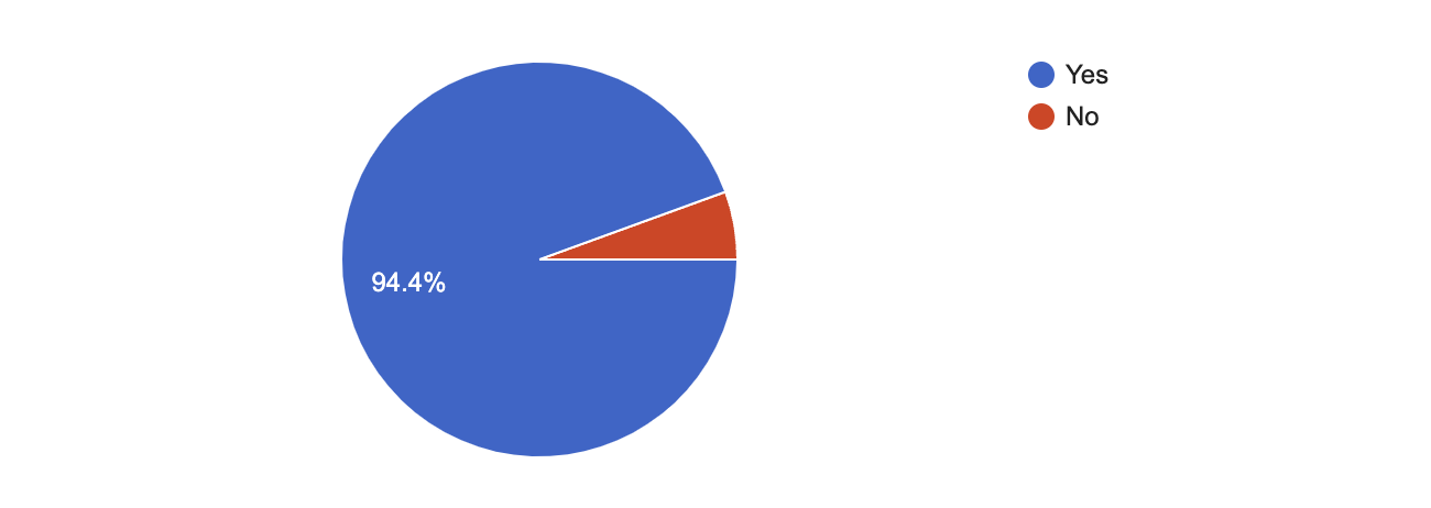 This pie chart shows the response from our question “Have you ever struggled to find a specific movie on any platform?”, users clearly are struggling to find more diverse content.
While users connect a little with others invested in film on social media, there’s a large gap for direct interaction with filmmakers beyond a follow on say, Instagram. A substantial portion of the users also expressed interest in exclusive content which supports creators though it is confusing or limiting on how to do so currently.
By focusing on enhanced discovery, community features, and direct filmmaker connections, we can offer a compelling alternative to traditional streaming. We aim to provide a curated space where film lovers can not only find elusive indie gems but also connect with the artists behind them, fostering a vibrant and supportive film community.
Overall, we found we could definitely point users to a powerful opportunity to build a platform that fosters direct creator-audience relationships.
Here are quotes coming from the respondents of the survey where they gave us some insight on what could be improved on for them.
Too many subscription services. There’s no one place where everything is available, though I do understand why.
This quote highlights the primary pain point of content fragmentation. For an indie film app, this means our value proposition should emphasize ease of discovery and access. We were considering features like a universal watch list or intelligent recommendations that direct users to our catalog of films.
The availability on the platform. Sometimes you the movie is not available and you need to watch on the movie theatre or rent it.
This statement from a user reinforces the content availability problem. Our app could serve as a central hub for indie film information, indicating where a film can be watched (streaming, rental, cinema dates), even if it’s not hosted directly on our app. This provides value beyond just streaming.
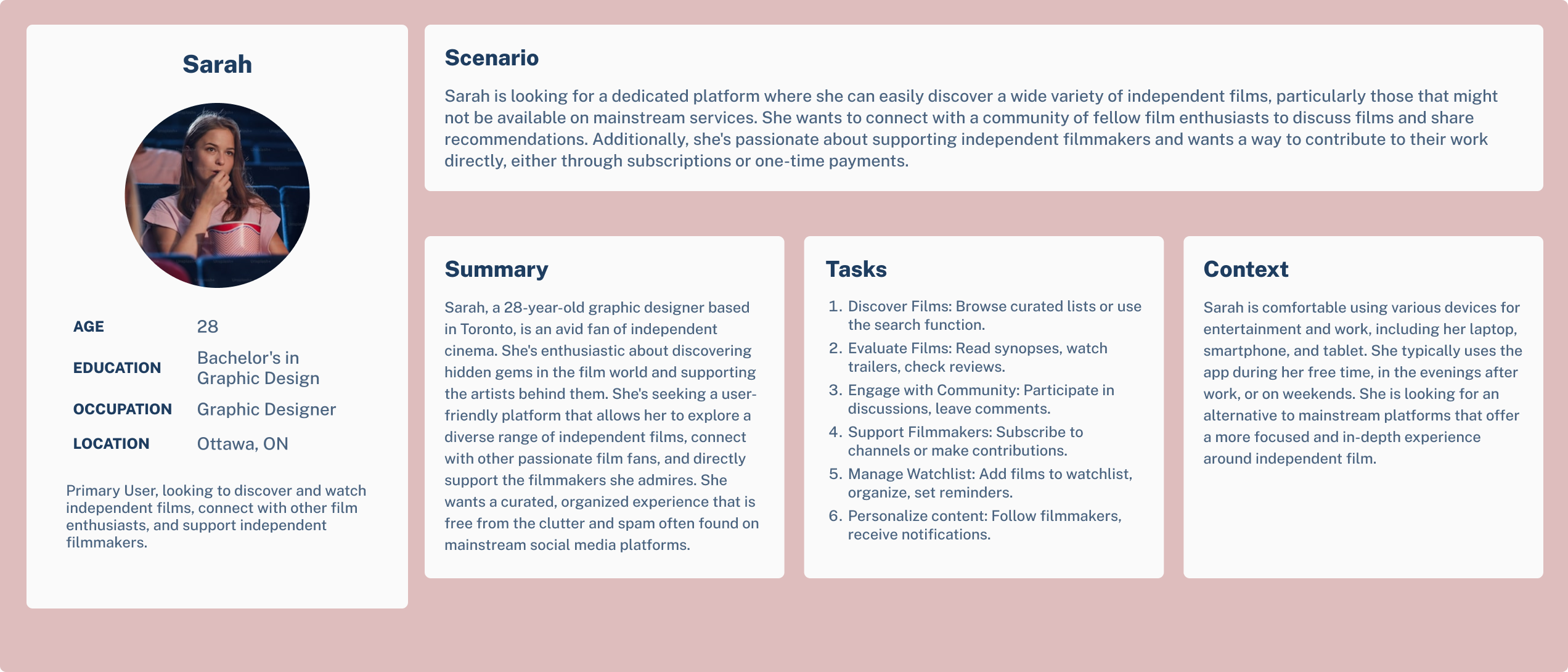
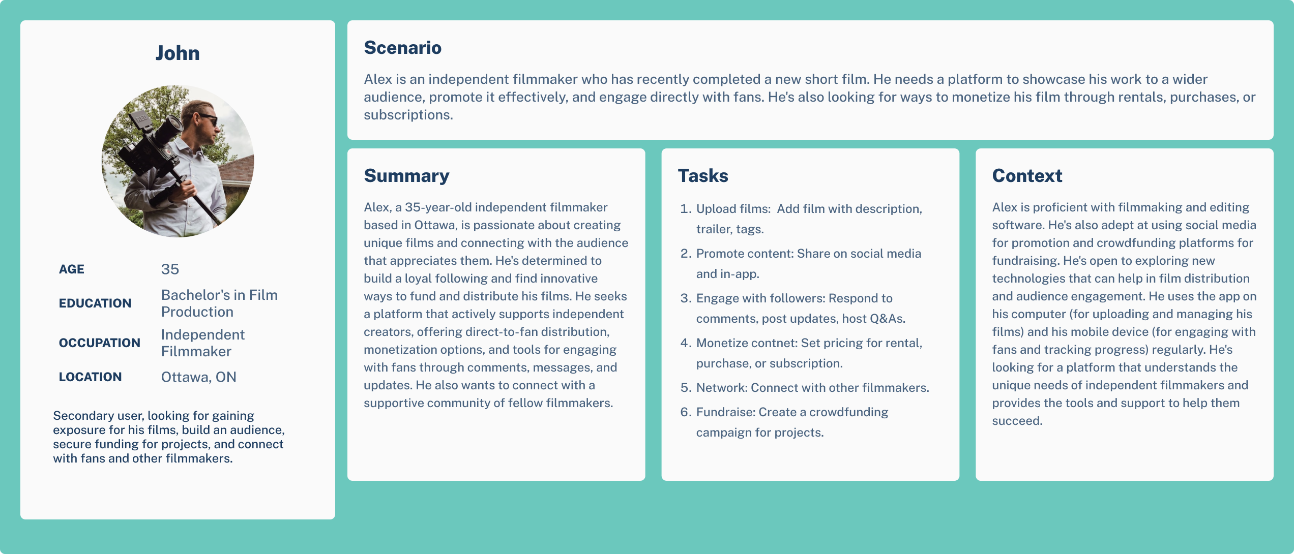
Persona Snapshot
For this project, we created two personas which were able to capture the idea of what a service seeker and service provider would look like.
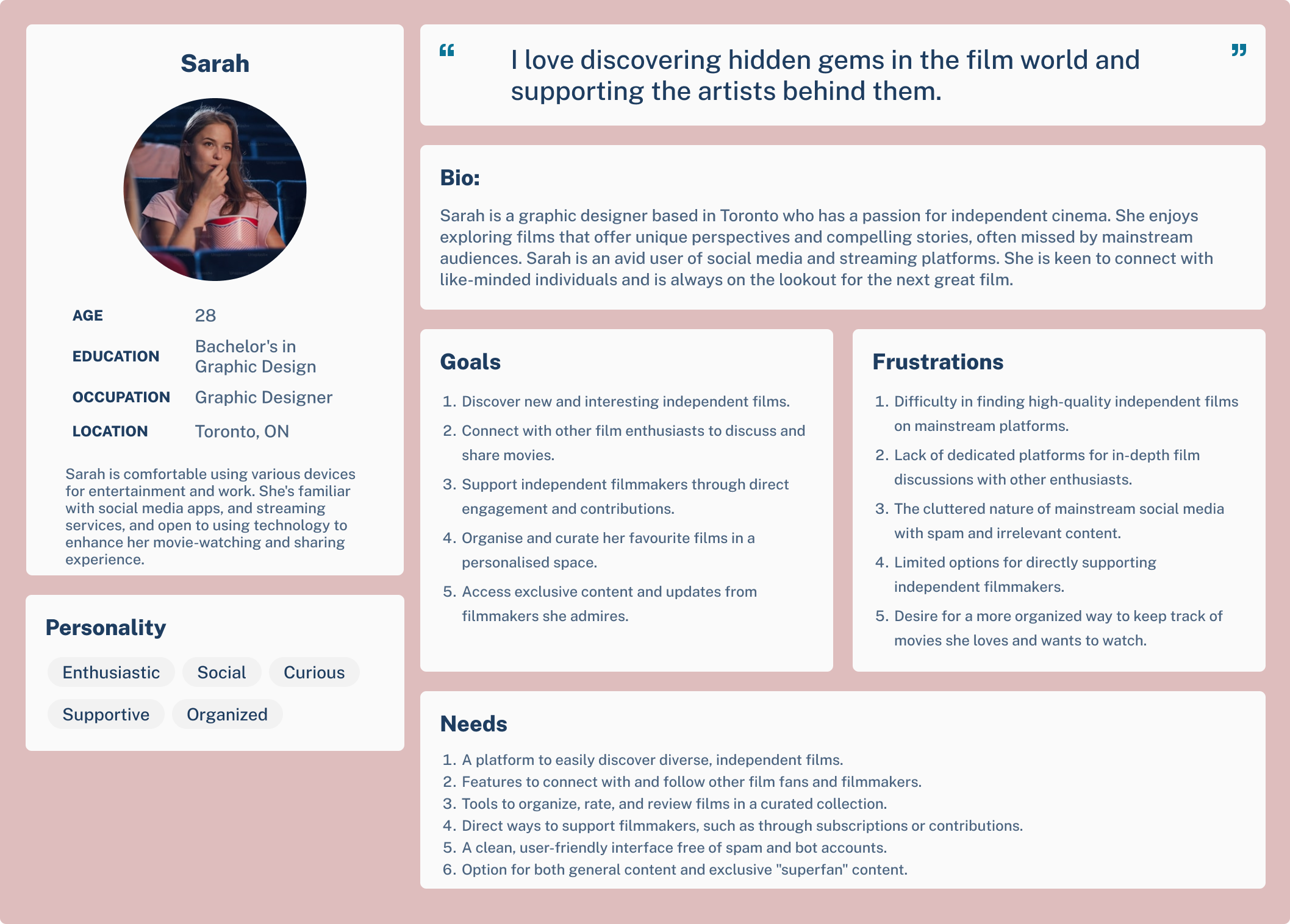 For the primary persona, we were able to form a persona that would be our service seeker looking for films. This would be a student or young adult involved in film in some way who has been trying to find unique films and directors. We did our best at capturing the essence of this kind of user to get an idea of what people we would be catering to mainly.
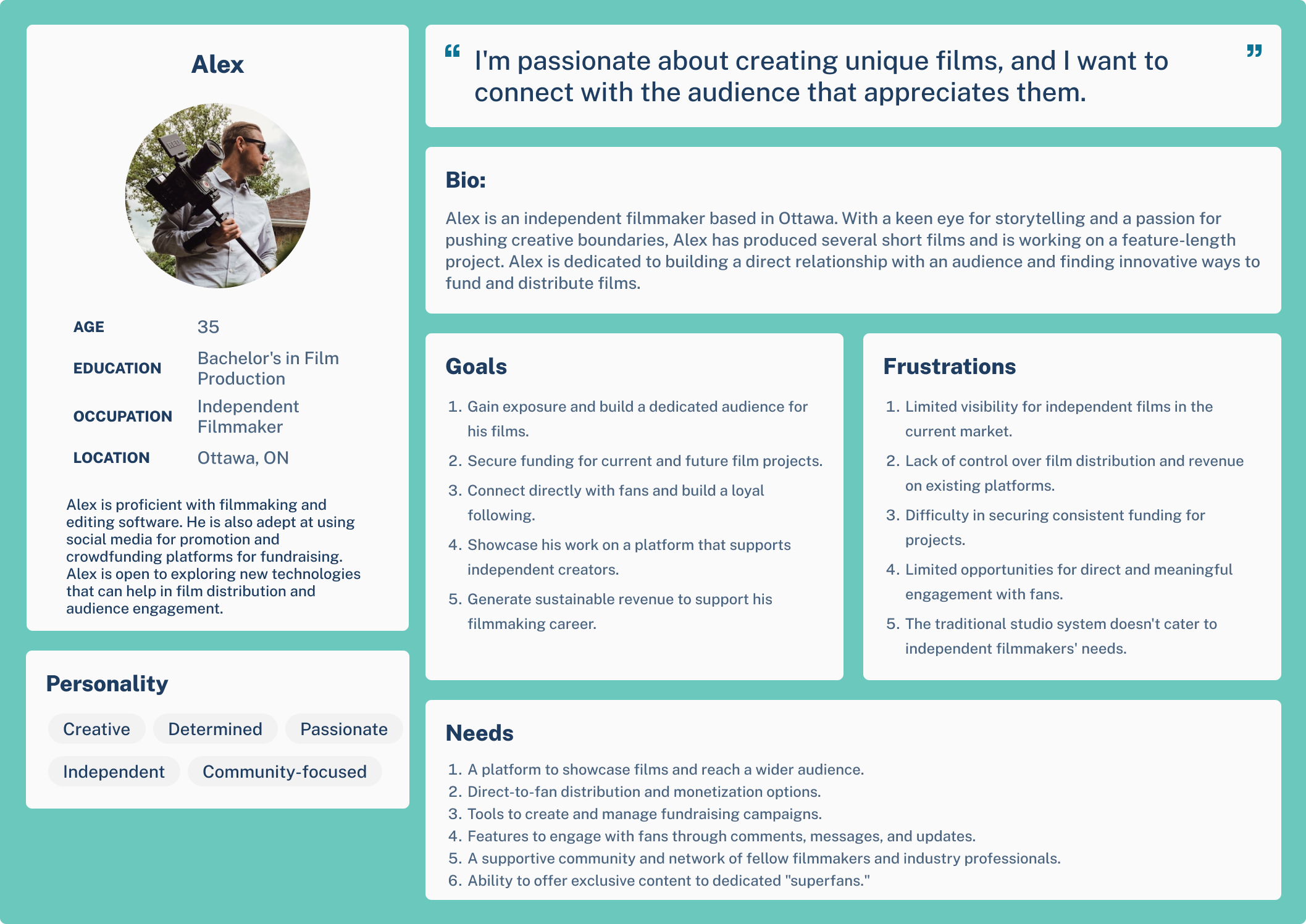 For the secondary persona, we created a service provider which would be an independent filmmaker who is looking for a way to build a solid audience that he can connect with and distribute his work to.
Along with this we created usage scenarios which showcase how our personas would use our app. We wanted to get an idea of the tasks that a user would be looking to do and how they would do them.
Competitive Analysis
To shape Pyralume as a unique and meaningful platform, we analyzed both social networking and video streaming platforms. Our research focused on how these apps connect creators and fans, how they build communities, and how they monetize content.
We broke down our competitor scan into three categories:
-
Social Networking Apps:
- How do people connect with others?
- How do users discover new people?
- What kind of content can users create and share?
- How do users interact? (e.g., comments, reshares, private messages)
- Is there a monetization system? (e.g., paid badges, ads)
-
Video Streaming Apps:
- What’s the business model?
- Is there a unique selling proposition?
- Can users interact with each other?
- Is there a community-driven element?
-
Role Dynamics:
- What is the relationship between fans, filmmakers, and festivals?
- How do roles differ in functionality and experience?
| Feature Category | Letterboxd | Netflix | MUBI | Seed&Spark | Vimeo | YouTube | |
|---|---|---|---|---|---|---|---|
| Structure | Social network | Film-focused | Streaming platform | Curated platform | Crowdfunding + Streaming | Streaming + Creator tools | Open video platform |
| Key Features | Reels, Stories, Creator tools | Logging, Lists | Streaming only | Daily film picks, Editorial | Fund films, Stream, Campaigns | Custom streaming apps, Monetization | Uploads, Live, Shorts |
| Interaction Type | Likes, Comments, DMs | Follow, Comment | None | Reviews, Ratings | Social tools, Updates | Comments, Subscriptions | Likes, Comments, Live chat |
| Business Model | Ads, In-app shop | Freemium | Subscription | Subscription | Crowdfunding + Subscription | Subscription, Rentals | Ads, Super Chat |
| Visual Aesthetic | Trendy, Image-first | Clean, Film-centric | Minimalist, Polished | Artistic, Curated | Indie, Campaign-based | Professional, Minimal | Flexible, Mixed |
| Strengths | Huge user base, creator tools | Film community | Big content library | Unique curation | Inclusive, Creator-focused | High-quality hosting | Accessibility, Engagement |
| Weaknesses | Popularity bias | No streaming | No interaction | Limited features | Smaller audience | Low community focus | Noisy, Variable quality |
| Focus on BIPOC/LGBTQIA | Not focused, diverse creators exist | None | None | Some global creators | Yes, priority | Some focus | Exists, not structured |
| Filmmaker Involvement | Creators post content | Limited presence | None | Low | High involvement | Strong tools for creators | Open to all |
| Fan Engagement | High: likes, shares | Reviews, Lists | Low | Medium | High: backers, followers | Passive viewers | High: comments, subs |
| Festival Participation | None | Some partnerships | None | Strong presence | Strong support | None | Used informally |
An analysis summary and key takeaways we learned from our research data:
- Instagram and YouTube are interaction-heavy but lack a focus on film or underrepresented voices.
- Letterboxd has a strong social layer but no streaming.
- MUBI and Seed&Spark provided inspiration for curated content and creator-first monetization.
- Seed&Spark stands out for community, inclusivity, and filmmaker funding, aligning closely with Pyralume’s mission.
- No single platform combines all core goals: streaming, social community, diverse storytelling, and filmmaker-fan interaction.
Problem Statement
How might we create a platform where independent creators and film enthusiasts can connect, showcase, and discover diverse voices in film?
Ideation
After wrapping up our discovery phase, we had a lot of ideas floating around—but our biggest challenge was time. With just a one month runway, we needed to think critically about what to build, what to defer, and how to stay aligned with both our users’ needs and the client’s vision.
How Might We
To help guide our brainstorming and make sure we were solving the right problems, I facilitated a quick HMW session with the team based on what we knew from user research and the client’s mission.
Here are a few of the key questions we generated:
- How might we connect fans with filmmakers in a way that feels personal and intentional?
We knew our users cared about community and authenticity, so it wasn’t just about following someone. It was about real discovery and interaction. This inspired our social feed, basic follow system, and the way we designed profiles.
- How might we highlight diverse and underrepresented creators in a respectful, elevated way?
This made us think differently about the visual hierarchy on profiles and collections. We emphasized creator content and unique voice, not just engagement numbers or trending tags.
- How might we keep the experience simple and welcoming while supporting future depth?
Our MVP had to be streamlined, but we didn’t want it to feel empty. This question helped guide the IA and set up the app for scalable growth, like planning for comments and chat in later versions.
Brainstorm Snapshot
One of the areas I’m most proud of was the Information Architecture (IA) I created for the app. Early in the project, I saw the need to structure all our features into a logical, scalable format, not just for this MVP, but also for where the app could grow in future phases.
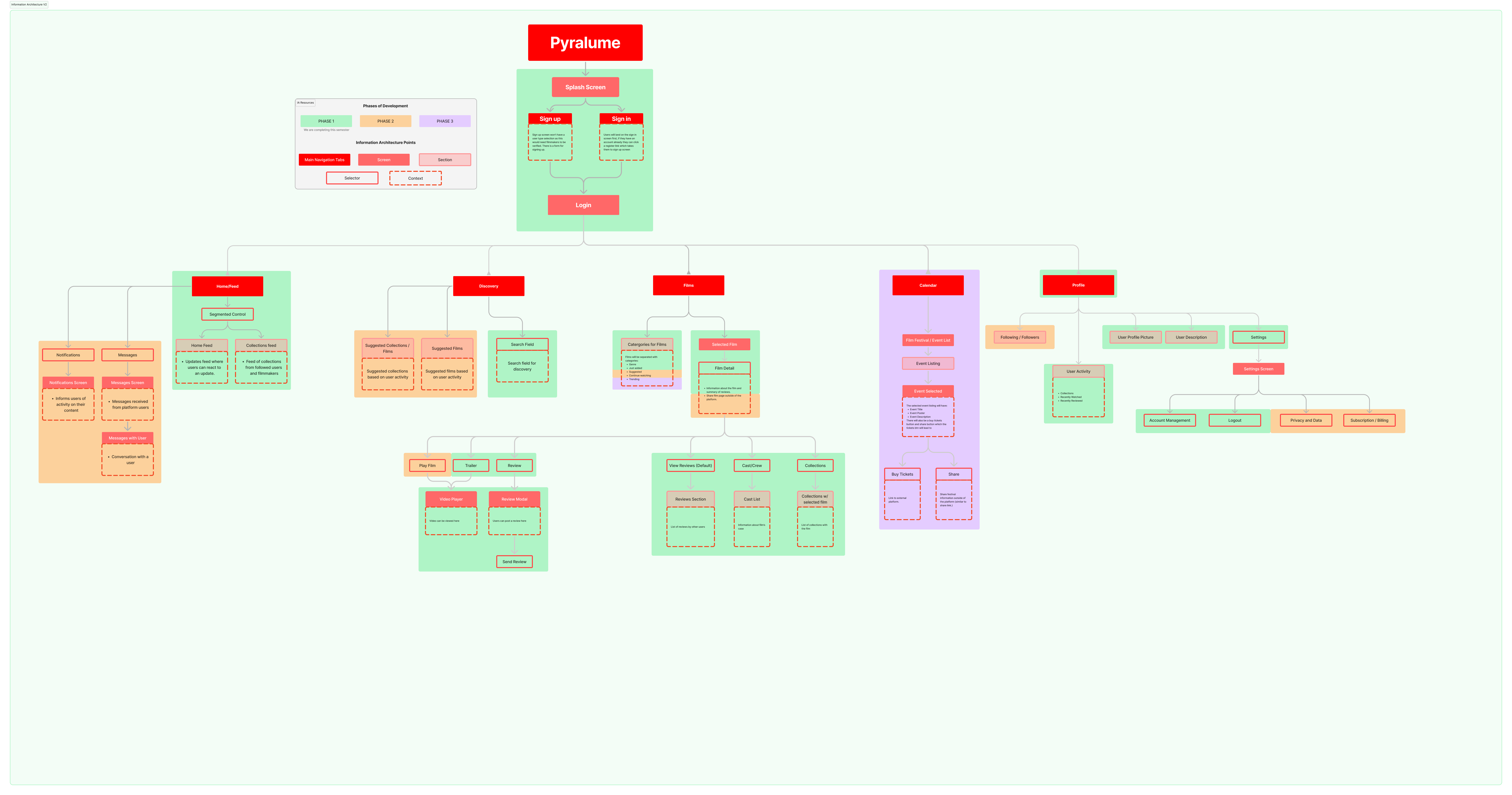
I laid out the app’s architecture in a clear, layered diagram, showing core navigation paths, supporting flows, and even areas that could be expanded later (like chat features, more advanced content discovery, etc.).
What made the IA really valuable was:
-
It served as a source of truth for our whole team. The design lead directly used it to move into screen design.
-
It helped align the client by showing them not just what we’d deliver now, but what we were laying the foundation for in the future.
-
It was concise, readable, and realistic, which the team appreciated in such a fast-moving project.
Looking back, this IA was more than a deliverable—it was a framework for how we worked. It brought clarity during chaos and helped us move forward confidently when things could’ve easily spiraled.
Feature Prioritization (MVP Thinking)
We took a very realistic and strategic approach to building our MVP. With our timeline in mind, I led conversations with the client and team to define the core experience that would bring value without overwhelming our development capacity.
We boiled it down to a handful of key features that struck a balance between usability, community, and creative expression:
-
User Profiles - We wanted creators and fans to have a space to express themselves and their identity.
-
Film Collections (Lists) – A lightweight way for users to organize, share, and discover films, hugely important for the indie film audience.
-
Movie Streaming – Since the app is centered around video, we made sure users could stream content from day one using packages within Flutter.
-
Social Feed – We kept this simple but essential: a central hub for fans and filmmakers to interact, post, and stay connected.
-
Follow System – Community was everything for our client, so we prioritized the ability for users to follow others and build networks.
This phase really tested my product thinking. I wasn’t just thinking as a designer, I was wearing the hat of a scrappy PM, a UX strategist, and a developer all in one. I had to prioritize fast, iterate faster, and communicate clearly between the client, the team, and the project goals.
UX Pillars
In our Ideation phase, we also defined a few UX pillars—core principles that guided all our design decisions. We actively kept these in mind during sketching, designing, and development.
-
Authenticity - Everything we designed had to support genuine connection. That meant profiles were rich, human, and unique. It meant avoiding generic content layouts and designing for voice.
-
Clarity - The app needed to feel intuitive to a wide audience: filmmakers, fans, and festival organizers. We prioritized clean navigation, clear labels, and simple interactions in our flows.
-
Empowerment - We wanted creators to feel seen and in control. From showcasing their films to curating collections, the UX had to give users tools to represent themselves.
-
Community - Every interaction needed to invite users into a space that felt inclusive. That influenced our social features, follow system, and even empty states (e.g., “Start your first collection” vs “You have no content”).
Overall, through this phase of our project, I believe I had shown I know how to build a product with intent, not just making it look good. I felt comfortable leading through ambiguity and making decisions fast, this was the case for our project as we were very limited on time and had tight deadlines. This in turn showed me the importance of designing with constraints and how to take hold of them and use them as a creative advantage. I deeply care about how the structure supports UX, team collaboration, and long term scalability.
Design
After aligning on the MVP and defining the core user flows, I dove into the visual side of the product right away. This phase wasn’t just about how the app looked—it was about clarity, functionality, and making sure our development lead had what they needed to build confidently.
Low-Fidelity Wireframes, Structure Before Style
This was the part of the project that I fully owned. I opened up Figma, locked in a clean mobile grid, and started mapping out the app from the ground up.
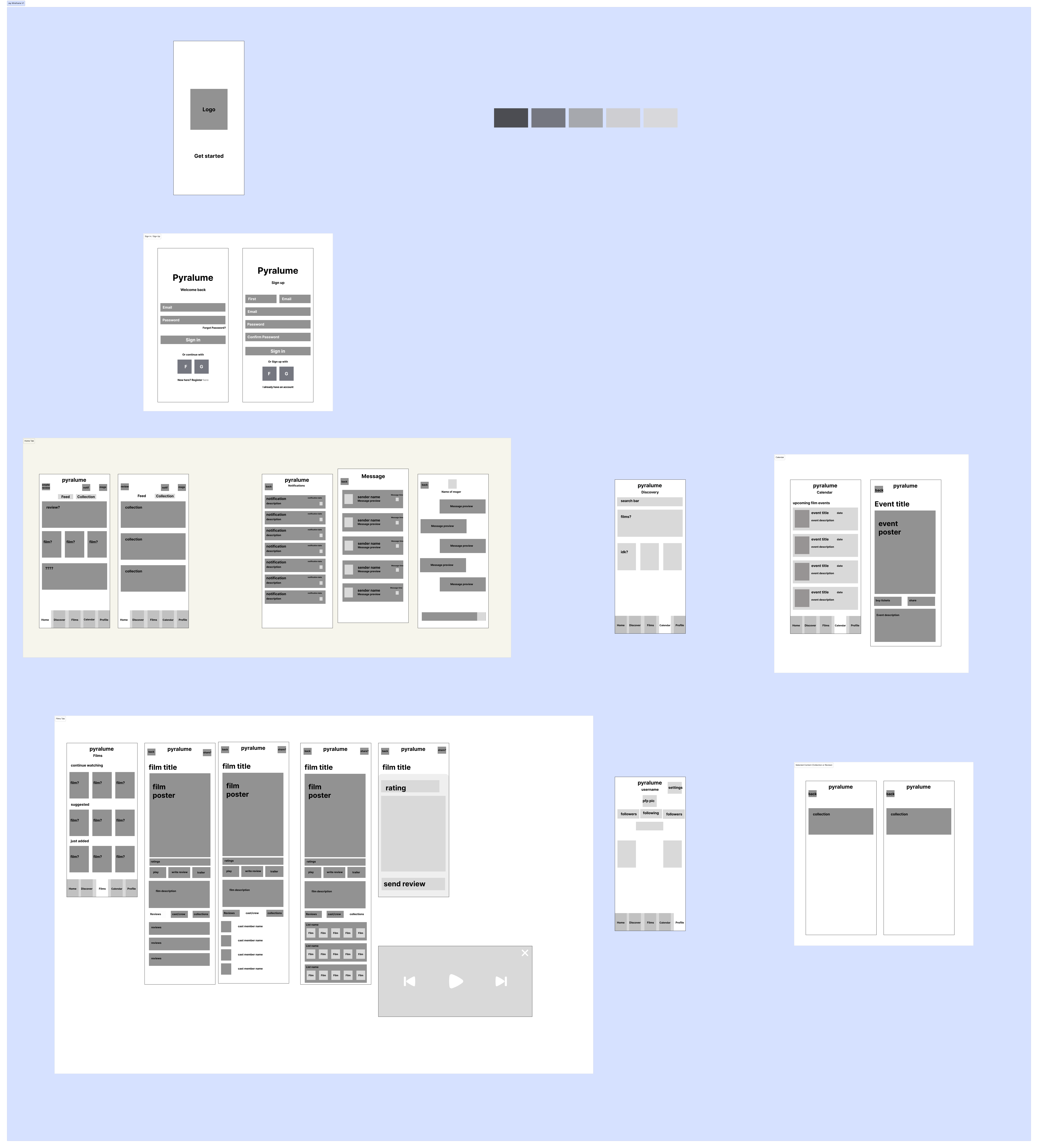
As how I usually start a wire frame, I kept things simple: grey boxes, proper spacing, component placeholders, everything to ensure usability and layout hierarchy were locked before any styling was added. Every screen was deliberately constructed to reflect the flows we had brainstormed during ideation.
Things I considered in my thought process:
- Placement of key components (e.g., buttons, cards, nav)
- Space for film collections, profile content, and reviews
- Modular layouts for scalability in future phases
- A focus on clarity and simple tap targets for mobile
Design System, Building Visual Consistency
While our design lead helped drive the visual direction, I played a major role as well in developing the design system that kept everything consistent, scalable, and dev-ready.
We knew we’d be working fast, so we created a flexible yet simple component library that our whole team could rely on.
I contributed to finalizing our colour scheme which matched the branding whilst following accessibility standards. Along with this, I worked with the team to create a component library in Figma, and I focused on defining spacing rules, radius, icon usage, and shadow systems.
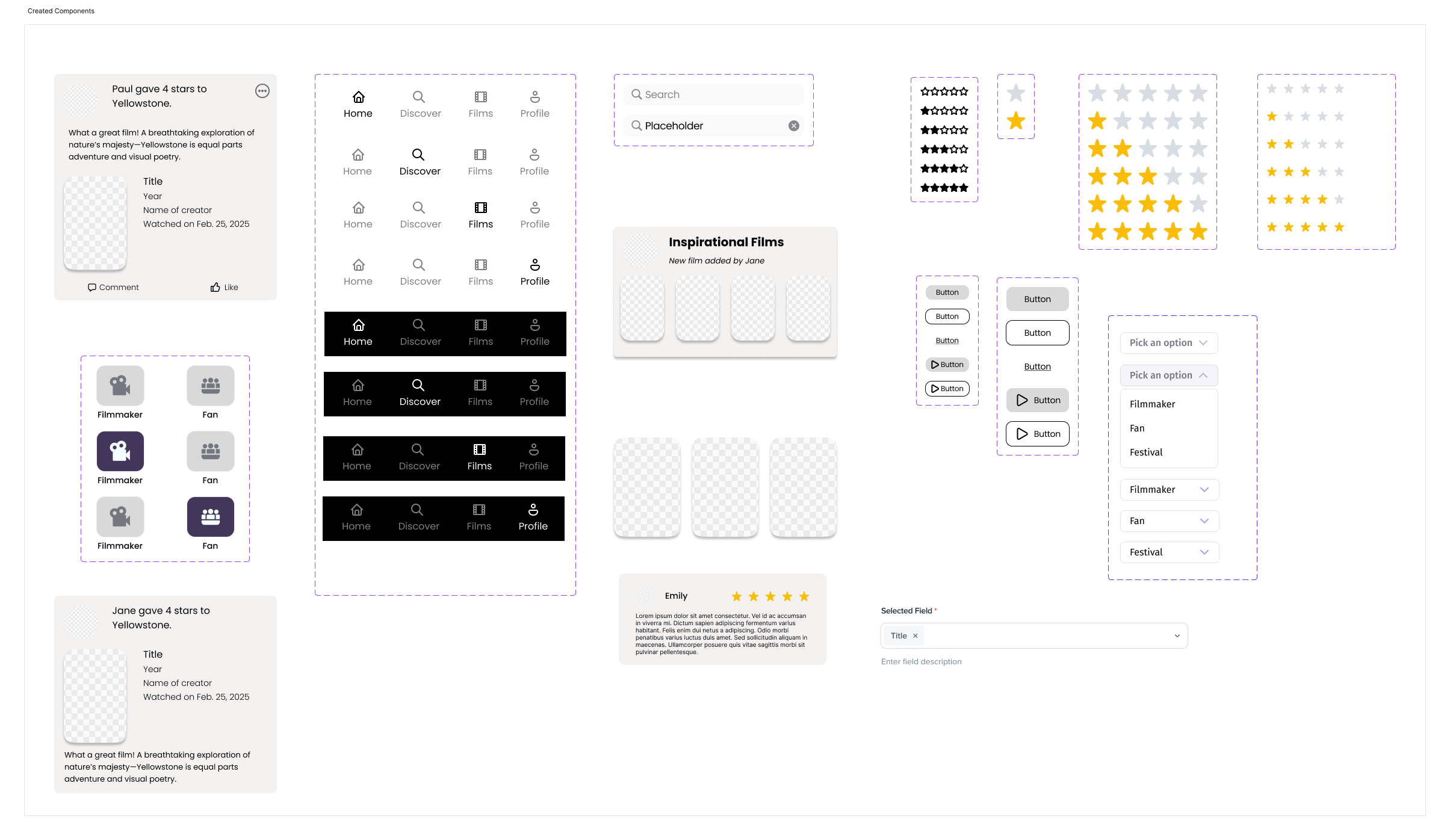
Our design system wasn’t just for looks—it was about reusability and speed. Every time a dev needed a consistent button, they didn’t have to ask. It was all documented and synced.
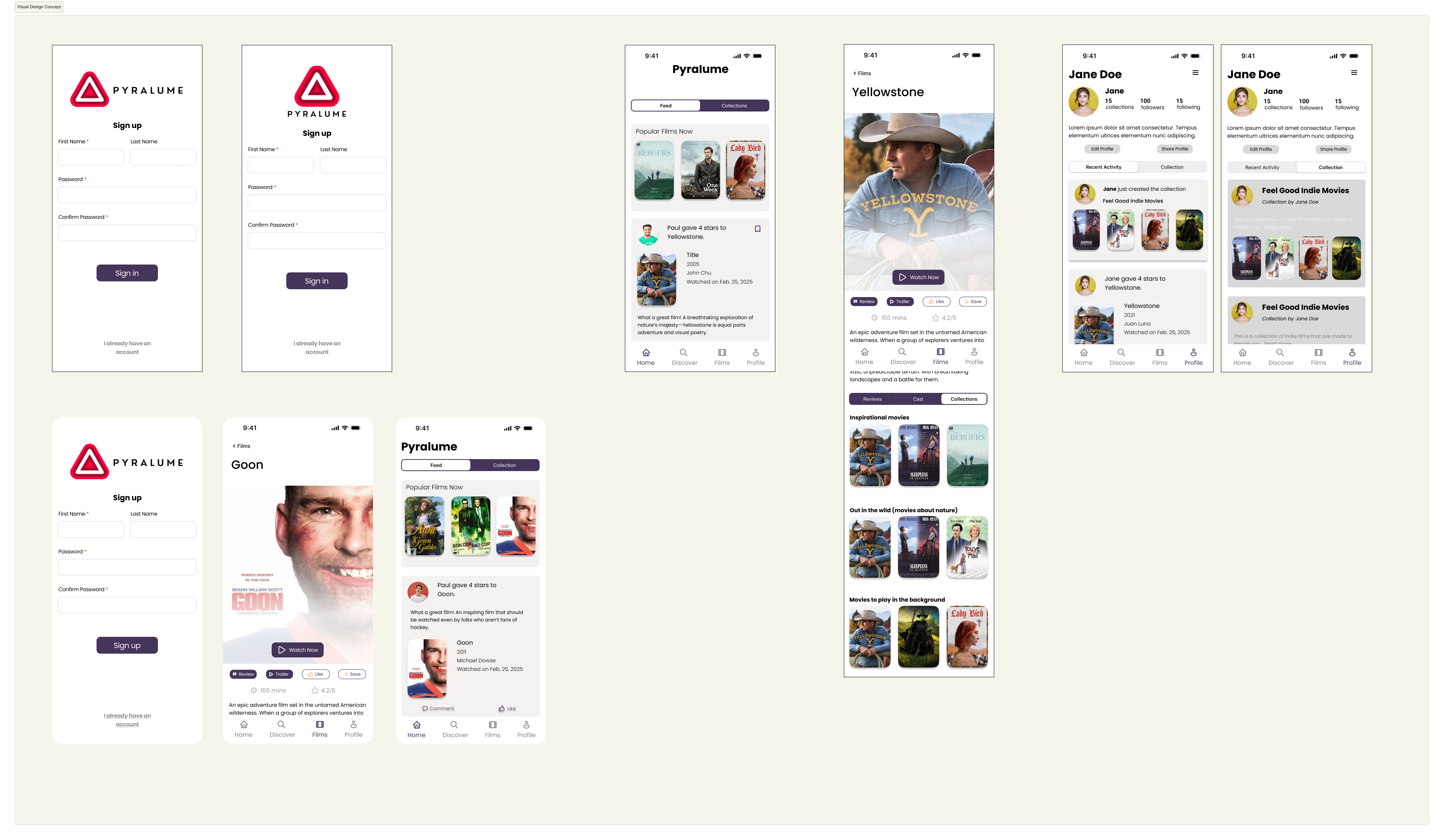
Mid & High-Fidelity UI
Once the skeleton was in place, we layered on branding, visual identity, and micro-interactions.
We were intentional about:
- Visual hierarchy: What does the user see first? Why?
- Focus states & feedback: How does a button behave when tapped?
- Cohesion across screens: Profiles, collections, and the feed all needed to feel like they belonged in the same world.
We built in visual elements that supported the narrative of underrepresented filmmakers, subtle use of colour, respectful space for user content, and layouts that felt curated but not overwhelming.
Development Handoff
As the project lead, one of my top priorities was making sure our design-to-dev handoff was seamless. We had to work quickly and clearly—there was no time for confusion or wasted effort.
How I led this part:
- Made sure every design screen was labeled, organized, and easy to inspect in Figma.
- Communicated directly with our development lead to walk through logic behind components.
- Created design notes and specs for animations, margins, and expected behaviors.
- Reviewed screens alongside dev to troubleshoot and adjust based on Flutter constraints.
This wasn’t a one-way handoff, it was a feedback loop. We checked in daily, solved blockers in real-time, and stayed on the same page from start to finish.
Prototyping
Once we had our mid-to-high fidelity designs in Figma, we stitched them together to create an interactive prototype. This was our way of validating the core experience before writing a line of code.
How We Used It:
- Internal demos to walk the team and professors through the user flow.
- Client feedback sessions where they could “use” the app and point out improvements.
- Usability testing where we gave users specific tasks (e.g., “Watch a short film,” “Leave a review”) and observed their flow.
The prototype allowed us to catch friction points early, like unclear navigation labels or cluttered collection screens and smooth them out before development.
Key takeaway: Prototyping helped us move fast without breaking things. We used it not only to test usability but also to align our entire team around a shared, tangible vision.
Usability Testing
We tested our prototype with our professors and classmates from our targeted demographic. We ran moderated sessions with open ended tasks, this helped us identify a few key issues:
-
Navigation Confusion: Users found it unclear how to go from a review to the user’s profile. → Fix: We added clearer CTA buttons and consistent iconography.
-
Onboarding Friction: The original onboarding flow was too long and had too much text. → Fix: We simplified with easier visuals and actionable copy.
-
Review Submission: Users didn’t realize their review was successfully posted. → Fix: We added subtle feedback states like confirmation toasts and visual cues.
Each of these small changes made the experience smoother, more intuitive, and more polished.
Development
This wasn’t just a design sprint, we built it. Our tech stack was Flutter for the frontend, and we integrated with a custom backend that our development lead built from scratch.
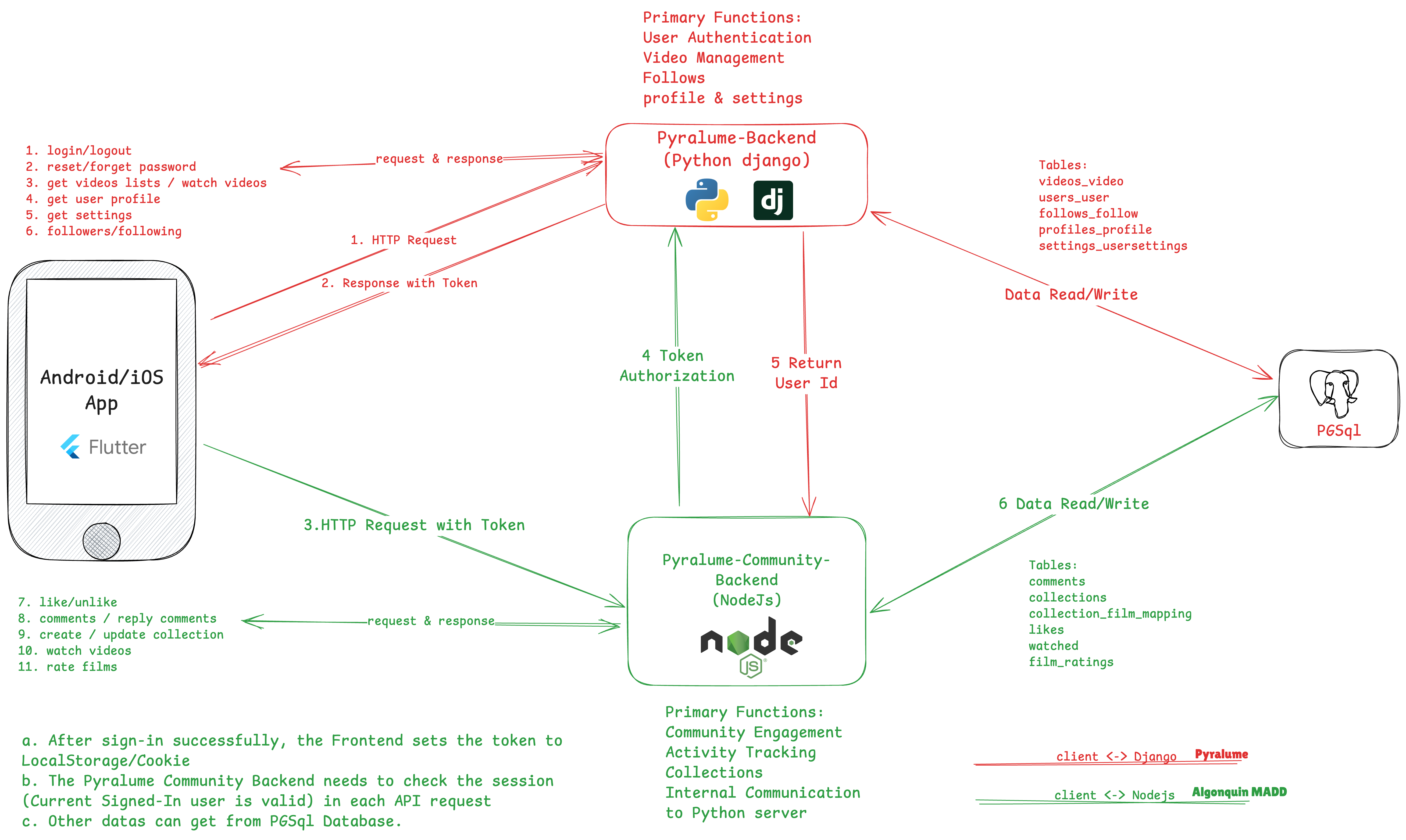
What I worked on:
- Developed key screens including Login, User Profile, and Film Browsing
- Implemented authentication functionality, setting up secure login with proper error handling
- Used our Figma designs to ensure pixel-perfect implementation
- Collaborated daily with our dev team to translate UI logic into working code
Backend Hurdles
Initially, we tried using the API provided by the client. Unfortunately, it lacked proper documentation and structure. After hitting roadblocks, our development lead spun up a custom backend with proper endpoints, which helped us:
- Fetch and display film data dynamically
- Support user authentication
- Allow review submissions and user interactions
Communication was key: As project lead, I ensured that both design and dev were aligned on components, flow logic, and development priorities. This made our workflow more efficient and minimized miscommunication.
Reflection
Looking back, leading the Pyralume project was one of the most rewarding challenges I’ve taken on.
We had a tight deadline, hit roadblocks with the API, and dealt with the pressure of building something from scratch, but I knew we could pull it off. Even when morale dipped, I tried to stay optimistic and focused on what we could control: supporting each other, breaking things down step by step, and staying aligned with the goal.
That mindset really paid off. Not only did we exceed expectations, but we built something the client was genuinely proud of.
I’m incredibly grateful for the team I had, we brought different skills to the table, but we moved as one. This experience taught me so much about project management, communication, and how important it is to trust your process and your people.
This wasn’t just a school project; it felt like building a real product with real stakes, and I’d do it all over again.